
Become a brand that goes beyond.
Your brand is an expansive calling card to customer trust. Develop a brand legacy to define the future Using the latest technology and tailor-made solutions, your business will
As a strategic leader in marketing and digital media with nearly 20 years of experience driving rapid digital platform growth, achieving significant cost savings, and executing innovative marketing campaigns. Proven track record in expanding digital reach by 5X, optimizing budgets with over $1.5 million in savings, and building influential networks that enhance ROI. Eager to leverage my expertise to contribute to transformational missions and develop a legacy brand to define the future
I am dedicated to sharing my knowledge and continuously advancing brand new avenues in communication using the latest applications.
Join me in my journey. Subscribe to my channel.
Responsive Text Section
This text will resize and wrap according to the device size, maintaining 3em of padding around the entire element on larger screens. On smaller screens, the padding and font size adjust for better readability.
Bring your brand back from the brink of extinction. 🦖 Check out my portfolio to see how I can bring solutions for success today.
As a multidisciplinary designer with a realist point of view, I am able to guide you down the most efficient and value-added path to meet your business goals.
No funny business here.
Only good people may apply.


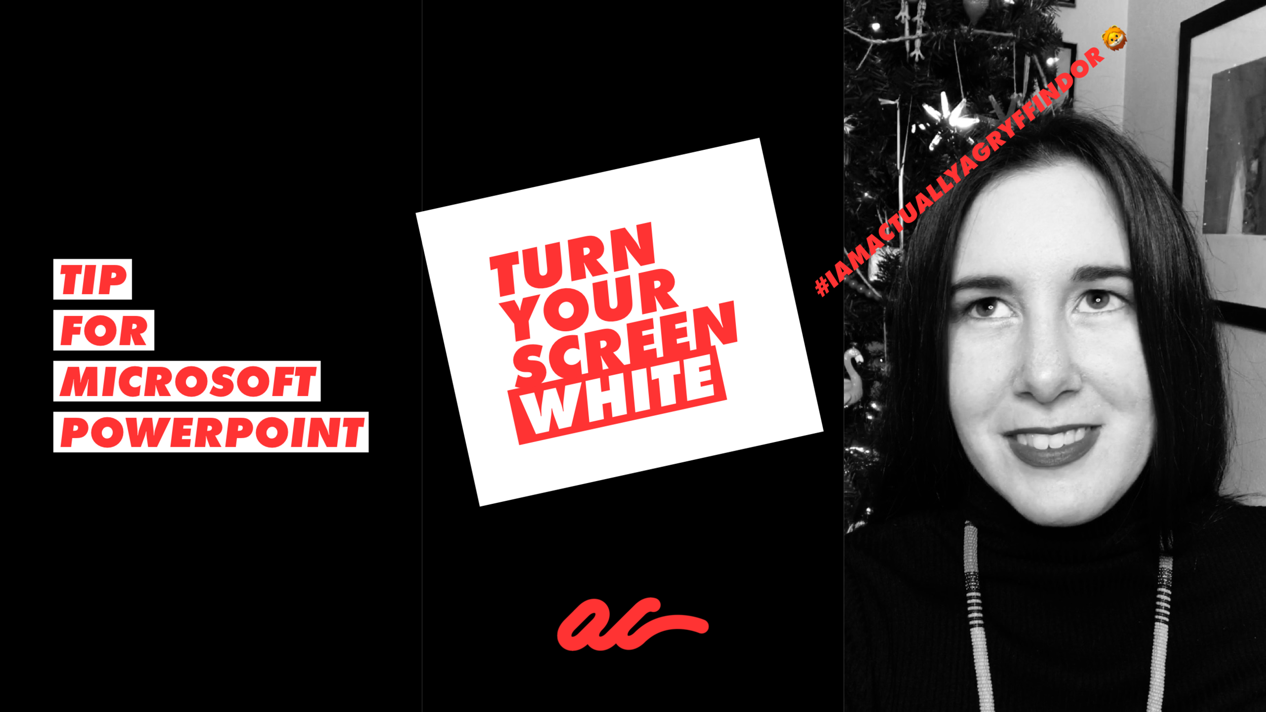
Fun tips to stay hip.
Scared to ask? Here I share some fast-grab tips to be more efficient today. No need to wander in wonder any longer – learn ‘how-to’ now.
